
Like this website? Tell your friends, family, and colleagues about it!
![]()
![]()
![]()
Your weekly briefing of news, data, opinion pieces, videos, and other resources to help you through the Covid-19 pandemic
Message to site visitors: We’re temporarily taking a break from updating many of the sections of this website while we figure out exactly what’s going on in the fight against the coronavirus — and how this website can play a genuinely constructive role in that fight.
NEW ANALYSIS ON 7/18/20
The problem with most charts and graphs tracking states’ efforts to contain the coronavirus pandemic is that it’s a multivariate problem — in any given state, you should ideally look at both (A) how prevalent the virus is and (B) how fast it’s spreading. This chart presents all of that information (plus state population size and whether it’s a “red” or “blue” state) in a single graphic. (That said, where the circles are overlapping, you may need to hover your mouse over a circle to learn the state’s name.)
Here’s another look at the data: The states are in easy-to-find alphabetical order, the right-hand column shows you last week’s rate of new cases per 100K pop., and a visual comparison of last four weeks’ data can give you am idea of how quickly new cases are growing or declining.
NEW ANALYSIS ON 7/11/20
The problem with most charts and graphs tracking states’ efforts to contain the coronavirus pandemic is that it’s a multivariate problem — in any given state, you should ideally look at both how prevalent the virus is and how fast it’s spreading. This chart presents all of that information (plus state population size and whether it’s a “red” or “blue” state) in a single graphic. (That said, where the circles are overlapping, you may need to hover your mouse over a circle to learn the state’s name.)
NEW ANALYSIS ON 7/4/20
The problem with most charts and graphs tracking states’ efforts to contain the coronavirus pandemic is that it’s a multivariate problem — in any given state, you should ideally look at both how prevalent the virus is and how fast it’s spreading. This chart presents all of that information (plus state population size and whether it’s a “red” or “blue” state) in a single graphic. (That said, where the circles are overlapping, you may need to hover your mouse over a circle to learn the state’s name.)
Note that there is a quirk in the Mississippi data; the data for neither of the past two weeks is trustworthy.
Please note in the chart below that the horizontal scale is different — last week (below), the maximum on the horizontal scale was a bit over 300, whereas this week (above), the maximum is now 400 to accommodate the increase in cases.
NEW ANALYSIS ON 6/27/20
The problem with most charts and graphs tracking states’ efforts to contain the coronavirus pandemic is that it’s a multivariate problem — in any given state, you should ideally look at both how prevalent the virus is and how fast it’s spreading. This chart presents all of that information (plus state population size and whether it’s a “red” or “blue” state) in a single graphic. (That said, where the circles are overlapping, you may need to hover your mouse over a circle to learn the state’s name.)
Key to reading this chart: As states move to the right (i.e., as they approach 200 new cases per 100K pop. per week), hospitals in some areas of the state will most likely start to get overwhelmed. (States at the top of the chart are getting worse more quickly than the others.)
And here is the same chart for the previous week. By comparing the two charts, you can see that most states are moving to the right — i.e., seeing an increased number of new cases each week.
And here is the data for the week of June 20-26 in table form:
What are the reasonable policy conclusions that we can take from the above data?
(1) If the states in the upper-right portion of the chart want to avoid overworked medical personnel and corpses piling up in hospitals in the near future, they need to either do better social distancing (including mask-wearing) or their elected officials need to move back to more aggressive lockdowns.
(2) But the states in the left-hand side of the chart — especially the lower-left quadrant — do not seem to be in any kind of near-term risk of major casualties. As long as their residents don’t get careless and sloppy, It seems reasonable for those states to open their economies even further.
Finding this useful? Let me know at kurt@accuradio.com, along with any analysis or suggestions you might like to share.
In the post below, note that the chart is slightly different — it uses a 14-day growth trend, not a 7-day growth trend.
NEW ANALYSIS ON 6/22/20
The problem with most charts and graphs tracking states’ efforts to contain the coronavirus pandemic is that it’s a multivariate problem — in any given state, you should ideally look at both how prevalent the virus is and how fast it’s spreading. Furthermore, ideally, to understand what’s going on in America as a whole, you might want to factor how big each state’s population is. And it’s also interesting to look at how the blue (Democratic-leaning) states are doing compared to the red (Republican-leaning) states.
This chart presents all of that information in a single graphic! (Note that it’s for the week ending June 19th.) Where the circles are overlapping, you may need to hover your mouse over a circle to learn the state’s name.
Find this useful? Let me know at kurt@accuradio.com, along with any analysis or suggestions you might like to share. Thanks!
NEW ANALYSIS ON 6/7/20
NEW ANALYSIS ON 5/25/20
POSTED 5/16/20:
EDITORIAL (5/16/20):
Back in March, when New York’s Covid-19 deaths per week were showing a horrifying weekly trend — from 0 to 35 to 484 to 2,416 to 4,909 — most of America’s governors (and/or mayors) chose to issue stay-at-home orders and school and business closings that largely shut down the U.S. economy.
As you may recall, the announced purpose of the plan was to “flatten the curve” — i.e., to suppress the growth in Covid-19 cases enough to prevent overloading our hospitals.
But somehow I believe “mission creep” has set in, in a manner similar to the way “Don’t leave your dog in a car with its windows closed on a hot day” evolved to “Don’t leave your dog in a car on a hot day” and subsequently to “Don’t leave your dog in a car.”
Looking at the charts above, it appears that some hospitals in a state start getting overwhelmed when the state’s reported Covid-19 cases start approaching the level of 200 cases per 100K population, which creates a nightmarish number of deaths in certain of the state’s hospitals (not throughout the state, but typically in regions of the state that have high population density and crowded public transportation). You’ve seen the stories — jam-packed hospital corridors, exhausted personnel, and backed-up morgues full of corpses (half or more elderly).
But is the goal still “Flatten the curve to prevent overloaded hospitals”?
If so, then why is, say, Vermont still largely closed, when its cases per 100K residents have declined from 46 per week a month ago to 2 last week? (And its deaths per week never exceed 1.8 per 100K residents and actually got down to .5 last week.) Its hospitals are nowhere near at risk of overload!
Vermont is an exaggerated example, but there are many, many states that have always had a flat-enough curve.
So what’s the actual goal?
“Get the infection rate down to near zero,” as some countries like Korea and New Zealand seem to have done, would be an appealing goal, but with millions of cases already out there in our population, it seems an impossible goal at this point. Since the coronavirus can be so deadly once it enters a senior center or nursing home, killing 10% to 20% or more of its population, “Protect our senior citizens” might be a reasonable goal.
I’m planning to re-watch some recent briefings from Governors Cuomo, Whitman, etc., to see if they state (or if I can infer) their goals. But it sure would be nice if we had one at the national level, so we knew why we are doing what we’re doing.
======
P.S. By the way, just as a side note (or maybe an editorial for another day), wouldn’t you think the U.S. Surgeon General would play a key role during our worst public health crisis in a hundred years? So why do we almost never hear from Jerome Adams? Perhaps because, like many of President Trump’s appointees, he’s completely unqualified for his position? (This is as opposed to CDC head Robert Redfield, who may be merely “very” unqualified. Between Redfield and Adams, their “DON’T WEAR FACE MASKS!” advice in March may have led to the unnecessary deaths of tens of thousands of people.)
NEW ON 5/15/20:
In a hearing before the House Committee on Energy and Commerce yesterday (5/14), immunologist Dr. Rick Bright, recently removed by the Trump administration from his role running the HHS’s Biomedical Advanced Research and Development Authority (BARDA), warned that our country lacks leadership and lacks a plan to prevent what could otherwise become “the darkest winter in modern history.”
Dr. Bright brought up a number of critical issues, including how his superiors failed to adequately respond to the alarms that scientists were making in January, February, and March; rejected urgent pleas to begin to acquire sufficient masks and other PPE materials; still have not proposed plans for adequate testing; are encouraging states to re-open despite the fact that they don’t qualify under the criteria described by the White House task force; and now are not doing adequate work to prepare for the production and distribution of a vaccine (assuming one is developed).
In the charts below, you can readily see which states are not seeing a 14-day decline in new cases — including many which are nonetheless opening up.
5/13/20:
BY KURT HANSON, CoronavirusWarch.com
According to the White House task force guidelines (which have not yet been officially abandoned), for states to consider loosening lockdown restrictions and beginning to re-open their economies, they need — among other things, including better testing and contact tracing — to be seeing a consistent reduction in Covid-19 cases during the previous 14-day period.
In the chart below, we show the number of new cases identified per state per week per 100,000 population for the past several weeks. (Mouse over a bar, if necessary, to see the exact number for a week.)
This approach allows you to see which states are seeing the most new Covid-19 cases on a per-capita basis and whether the state is seeing an increase or a decline in new cases per week.
By my reading of the data below, the six places that seem most problematic — i.e., they have a growing number of cases per week, and they’re on a path that could get them near 200 cases per 100K pop. per week in the near future, are the District of Columbia, Iowa, Illinois, Maryland, Minnesota, and Nebraska.
Here’s another version of the same chart, showing only the last three weeks, with the statens sorted in descending order of cases-per-100K-pop. last week:
In the chart below, we show the total number of new cases identified per state per week over the past three weeks. This is not a per-capita number, it is the actual total number state. (Mouse over a bar to see the exact number.)
By the task force’s criterion, Alabama, Arizona, and California would not be eligible to consider reopening, but Arkansas would be eligible.
NEW ON 5/2/20:
According to the White House task force guidelines, for states to consider loosening lockdown restrictions and beginning to re-open their economies, they need — among other things, including better testing and contact tracing — to be seeing a reduction in Covid-19 cases during the previous 14-day period.
In the chart below, we show which states saw a decline in number of hospitalized patients between April 15th and May 1st. (Mouse over a set of bars to see the exact rate per 100K population.)
Note: Looking at the statistic of hospitalized patients may be a better measure than looking at new cases, since it is a more statistically stable number than “new cases,” which bounces around a lot from day to day. Also, it is unaffected by a state’s testing rate, as discussed a few paragraphs below. Unfortunately, however, not all states provide this statistic on a daily basis.
NEW ON 4/27/20:
Because data for individual days fluctuates wildly from day to day, we’ve chosen to look at seven-day intervals (using a Mon.-Sun. week), comparing last week (April 19-26) to the same interval 14 days earlier. This may not be the approach that the task force had in mind — if indeed they did have a specific approach in mind at all — but it seems reasonable.
In the map below, we show which states saw a decline in new cases in shades of green. (Mouse over a state to see the exact percentage of decline or increase. Click the map to zoom in on specific regions.) States which had an increase in new cases (and thus would be definitely ineligible) are shown in red.
We should note here that the rate of change in new cases is quite different than the quantity of new cases. This table reveals which states had the greatest quantity of new cases, expressed per 100,000 residents so you can more readily see which states might be getting overwhelmed. (Why “per 100K” matters: California had a lot of new cases last week, but that’s primarily because it’s a big state. Per 100,000 residents, it had a relatively small number of new cases.)
For what it’s worth, here’s the same data in map form:
NEW ON 4/27/20:
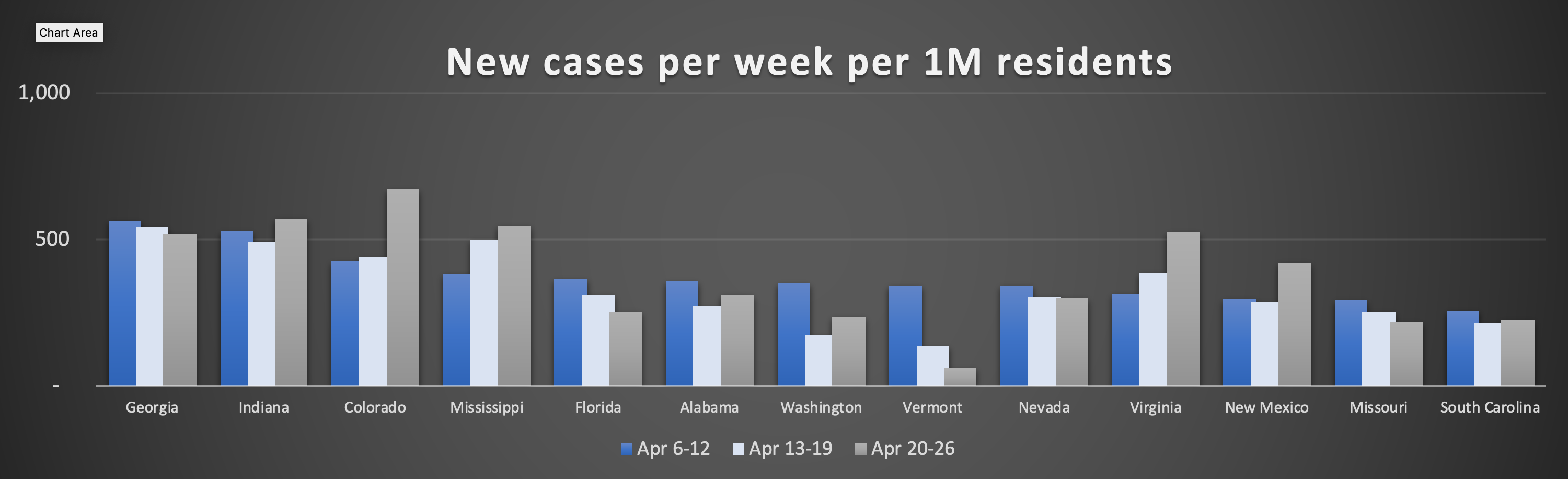
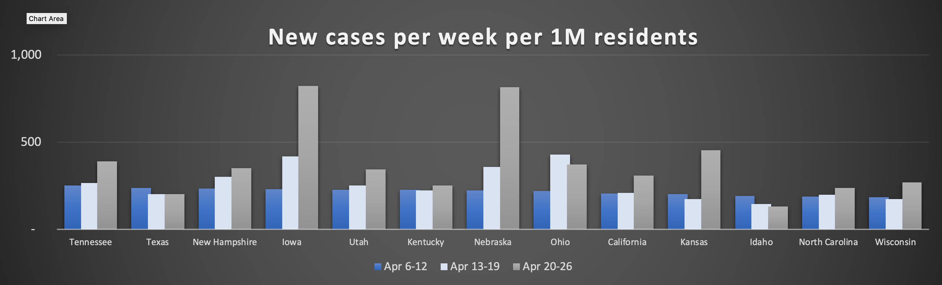
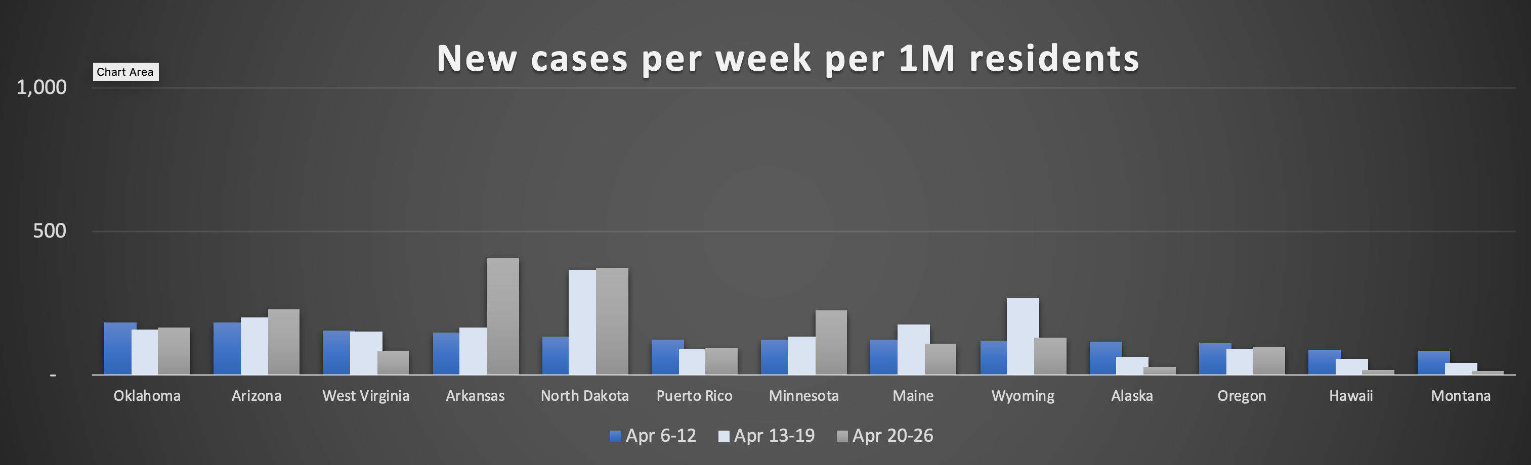
In the charts below, we’ve chosen to display new cases per week per million residents, to make it clearer how much each state is affected relative to one another. (Had we used raw case numbers, the size of the bars would be different (e.g., California’s would be much higher), but the percentage changes over the 14-day period would be the same.) The three bars shown for each state below are last week (medium grey), the period 7 days before that (very light grey) and the period another 7 days before that (blue). (Thus the blue bar represents the period 14 days before the medium grey bar.)
First, let’s look at the 13 states that had the highest number of new cases per million residents during the week of April 6-12. (Click chart to expand it):

Perhaps the most noticeable aspect of the chart above is the significant increase in new cases in Massachusetts, Rhode Island, and Delaware.
But you can also see that only New York, Louisiana, and Michigan show a clear and consistent decline over the period under analysis.
Note that two states are down from two weeks ago but up a bit from one week ago week: New Jersey and Pennsylvania. This brings up an interesting question: What if a state’s 14-day trend is downward but its 7-day trend is upward? The guidelines call for a “consistent” decline, which would suggest that New Jersey and Pennsylvania would not qualify for consideration.
Of the next 13 states, you can see below that only Georgia, Florida, Vermont, Nevada, and Missouri show a clear and consistent decline over the period. (These states show a decline from 14 days earlier but an increase from 7 days earlier, so their eligibility is arguable: Alabama, Washington, and South Carolina.) (Note also the increases in Colorado, Mississippi, Virginia, and New Mexico.)
In the next set of 13 states, the only two that seem to be qualified to consider opening up a bit are Texas and Idaho. (What’s most noticeable is the big increases in cases in the midwestern states of Iowa, Nebraska, and Kansas.)
In the final set of 13 states and territories — which represent those that were least affected by Covid-19 on a per-capita basis when this analysis began — we see significant upwards bumps in cases per week in Arkansas and North Dakota, plus moderate increases in Arizona and Minnesota. Regions qualified to consider re-opening include West Virginia, Puerto Rico, Alaska, Oregon, Hawaii, and Montana:
A couple more observations: (1) Theoretically, an increase in identified new cases could be an unintended consequence of significantly increased testing going on in a state. It would be a flaw in the task force’s approach if states were penalized (by being considered unqualified under federal guidelines to loosen restrictions) if they were doing what they should be doing — i.e., increasing testing significantly. (2) Tracking deaths per week rather than new cases would solve that problem, but would introduce an additional two-week or more lag time. (3) Tracking new hospitalizations per week might work, but as far as we knew there is no reliable and readily-available source of that data on a national (or global) basis.
These charts are based on data from Worldometers.info/coronoavirus.
Have any insights on this data you’d like to share? Please write the author of this piece, AccuRadio CEO Kurt Hanson, at kurt@accuradio.com. Thanks!
We believe these are the three biggest issues going on vis-a-vis the Covid-19 pandemic:
-
- RE-OPENING THE ECONOMY: Some members of the White House task force and many state governors are getting anxious to start re-opening certain states’ economies. However, do any states meet the federal guidelines of two weeks of declining Covid-19 cases? Do any states have adequate testing and tracking programs in place? Which elements can be opened first without causing a resurgence of the virus — schools, local shops, car dealerships, nail salons?
- RANDOM TESTING: To re-open our economy, we need an organized program of testing based on random sampling to determine the true extent of the Covid-19 virus in the general population. (New York conducted the country’s first major such test this week, finding that the true number of cases in the population is far, far higher than the official one.)
- MAINTAINING STAY-AT-HOME: As governors and public health experts push for citizens to respect shelter-at-home guidelines, certain Tea Party-esque types are calling for a “resistance.” Last week, President Trump actually encouraged people, via Twitter, to rebel against his own guidelines!
Those are arguably the big three, but in addition…
-
- SMALL BUSINESSES: Small businesses are getting desperate for the second tranche of PPP loans, which will cover about two months’ of payroll and rent for affected businesses — although with clumsy rules that require businesses to rehire their employees during an eight-week period in which their businesses might still be closed (and during which time those employees might get a bigger paycheck if they choose to stay on unemployment). Is that helpful?
- SWABS & REAGENTS: States are crying out to the federal government for swabs and reagents, without which they testing kits they’ve been provided are worthless.
- FOCUS ON UNRELATED PRIORITIES: President Trump and his team (Miller, Mnuchin, etc.) seem to be using this crisis as an excuse to push through unrelated priorities — more tax breaks for (and grants to) the wealthy, shutting off immigration, etc. (Last week, more moves on the immigration front — plus news that billions of purported “small business” loans actually were given to very large businesses.)
- W.H.O.: Trump has pulled the U.S.’s funding from the W.H.O. at the exact time they’re desperately trying to prevent the coronavirus from making it into Third World countries, where it could cause mass slaughter.
- TASK FORCE QUALITY: The White House task force (except for Drs. Fauci and Brix) may lack experience in and competence for managing a major public health crisis.
- HUNGER: Food banks are getting increasingly stressed out — there’s way too much excess food on the farm level, but not enough money or volunteers to get it to the people who need it
- PERSONALITY DISORDER: The ultimate underlying problem in the U.S.’s handling of this crisis may be, according to some observers (including, notably, George T. Conway, Kellyanne’s spouse), that President Trump arguably exhibits a condition called Narcissistic Personality Disorder. People with that disorder are hostile to expertise, unconcerned with truth, incapable of empathy and compassion, and focused in every decision on how it will in the short term affect them personally and/or get them increased adulation from others. A person suffering from this disorder would not be the ideal individual to be leading a major nation during a public health crisis.
FEATURED RESOURCES
VIDEO OF THE DAY
– Advertisement –

COVID-19 HOMEPAGES


Many of the world’s top newspaper, magazines, websites, and broadcasters have consolidated their coronavirus coverage on a single page of their website. Visit any of those topic homepages by clicking on a logo above.
Subscribe to our newsletter
LINKS


PODCASTS: